Results

img
Alexander Kim
12 December 2018import pandas as pd
import numpy as np
import matplotlib.pyplot as plt
NCHS = pd.read_csv('NCHS_-_Leading_Causes_of_Death__United_States.csv')
NCHS.info()
year = NCHS[['Cause Name', 'Year', 'Deaths']]
year_group = year.groupby(['Year','Cause Name'])
year_group_total = year_group.sum()
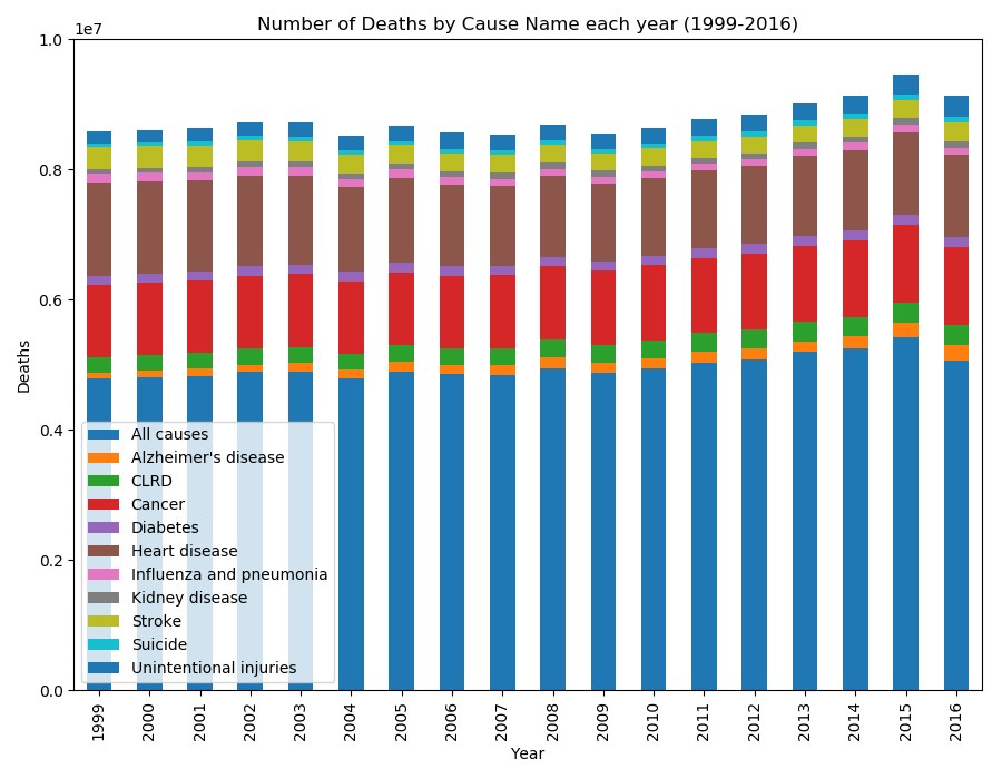
barplot = year_group_total.unstack().plot(kind='bar',stacked=True,title='Number of Deaths by Cause Name each year (1999-2016)',figsize=(9,7))
barplot.set_xlabel('Year')
barplot.set_ylabel('Deaths')
barplot.set_ylim((0,10000000))
barplot.legend(["All causes","Alzheimer's disease","CLRD","Cancer", "Diabetes","Heart disease", "Influenza and pneumonia", "Kidney disease", "Stroke", "Suicide", "Unintentional injuries"])
plt.show()
img